Richard joined Jarrolds as an Apprentice Compositor and ultimately became Head of Graphic Design at Her Majesty’s Stationery Office in Norwich (later the TSO).
I was born in Norfolk at the Norfolk and Norwich Hospital just after the war in 1946. My dad did come back from the war, obviously or I wouldn’t be here. He died in 1948 as a direct result of what happened to him during the war and my mum was left with two sons who were born before the war plus me. She was pregnant with my sister when my dad died so she brought us all up. One thing that my dad had insisted upon, I think the story goes, was that his boys would all have a trade. He never had a trade and so we did all end up with a trade: one electrician and two printers but my sister was the only one who went to university.
We lived on both sides of Norwich during the time that I was with my mum. We lived off the Avenues on Swansea Road. Then we moved to the other side of Norwich to be with my grandparents at Magdalen Gates. Not far from where I ended up starting my apprenticeship at Jarrolds at Whitefriars so it was in easy walking distance.
In those days we were part of the bulge of youngsters born immediately after the war and they swamped the education system. Although I passed the 11-Plus, there was no place for me in a grammar school. It was just at the introduction of Secondary Moderns and I went into a GCE course at the Alderman Jex in Norwich where we stayed on through the fifth form and did our O-Levels. So that was my initial education. I eventually took everything up as far as degree level.
I left school at 15, just a week or so before my 16th birthday and I actually started work on my birthday.
The apprentice
I didn’t go to university. I did it the hard way by doing all the paper work at home – all to do with the printing industry. By then I was doing graphic design so it was a degree in graphics. In fact, to be absolutely fair, the degree status for the course that I did wasn’t actually applied until about a year after I finished it but it was exactly the same paper and was recognised as the same. It was a course, I think it might still exist, run by the City & Guilds called ‘Design for Print’ and it was run at Norwich Art School which is in St George’s – still is.
This was at Jarrold & Sons where I was an apprentice compositor – the compositor’s job was hot metal composition. We set the type and put the pages together, all in hot metal for letterpress printing. I was apprenticed to a guy called Teddy Tuck who lived just a little bit further up Marlborough Road than me. I learned so much from Teddy that I appreciated afterwards.
Jarrolds
So, I joined on my 16th birthday and my apprenticeship was ‘satisfactorily completed’ it said there, signed by Peter Jarrold, director on the August 14th 1967. So, then I was a fully qualified compositor – a journeyman.
Jarrolds employed hundreds of people – I think about 1400 people. We did mostly hard back book work with a few soft back books but not many paperbacks. We were at the beginning of the process – the comp room. There were several machine rooms: there was the letterpress machine room, there was the litho machine room and there was the bindery. So, all of that would be drawn on and then there were the distribution networks – it was enormous.
Hot metal
It was quite complicated and also it was archaic by today’s standards. You could have taken William Caxton, one of the first printers in the UK to work with movable type and you could have sat him in our Jarrold composing room and except for a few wonders of mechanical composition he would have understood the process completely – it hadn’t really changed. It was only the application of machinery to set type rather than everything being done by hand that had changed but we did lots of hand composition as well – corrections and things like that.
Every letter stood on a little individual piece of lead. So, if you had a letter ‘m’, it was a bigger piece of lead than a letter ‘i’ and these letters were cast on a monotype caster which was fed with molten hot metal that was injected into moulds and it was controlled by paper tapes which clattered away. It was a very noisy process and it produced lines of type. The overall parameters were: what size type it was and how long the length of the line was.
That part of it was mechanised and the type used to come off in great long lengths. If you knocked it over it would go everywhere and it was called ‘printer’s pi’. It used to come off on trays which were called ‘galleys’ which were filled up. At that point there wasn’t any pagination, it was just raw material.
On a newspaper you get very narrow columns but we didn’t do newsprint – we did books. The line length and what they called interlinear spacing would all be predetermined. You’ve probably done it yourself on your computer. When you create some rows of typing, it’s often too close together and so Microsoft Word allows you to add a percentage so that it opens the lines up. That percentage was called ‘leading’ because when it was done by hand, strips of lead were inserted between the rows of type to space it out – we did that.
Composition
Then it went to the compositors to be corrected. All the galleys were put on hand proofing machines which were like a mangle. We used to put the galley with the type on and ink it up by hand. As I said, it was still quite an ancient process: lay a sheet of paper on the top, run the mangle over it and then you had a proof – that was an apprentice’s job. We used to get all the new typesetting from the mechanical composition area and we prepared the ‘galley slips’ as they were called. We used to prepare them for the printer’s readers.
Printer’s readers would go all the way through it and mark the corrections but it was mostly apprentices who did those corrections by hand. We used a hand ‘composing stick’ and popped single lines into it. We got quite deft at lifting these lines from the mass of loose little characters. You lifted a line and popped it in your composing stick. You then had to make that line exactly the same width as the preceding line and the next one so that it fitted perfectly. We did that by altering the spacing between words by reducing or enlarging until it fitted nicely into the composing stick. You would then lift it and pop it back into the galley. When the galleys were all corrected the printer’s readers were happy.
Pagination
Then they would go along to the journeymen. Some of these were amazing craftsmen and they would take that raw type and they would paginate it. The shape of the book would already be predetermined. There were some lovely old names for the paper sizes – everybody just thinks its A4 or A5 these days, but we had so many different sizes of book.
If you look in an old bookshop you will see the different sizes on the shelves. There was Royal Octavo, I’d be hard-pushed to remember them now but I used to know all the measurements for these in inches. There were just so many different sizes but then A sizes came in. That was long after I’d finished being a hot metal compositor.
So given the size of the book, it would have a pre-determined page length by the number of lines that would appear on that page. Some were perhaps in the region of 40 lines or so. It might have a header at the top which would be the chapter name and a chapter number on the opposite page. It would certainly have had a folio at the bottom – folio being the name for the page number.
So, all of that would be made up and then those individual pages would be initially just tied around with string. They were still sitting on their galleys at this point but they were short ones now. Each galley would contain one page and then those pages would go on to another process which was called imposition.
Imposition
Imposition was taking all those pages, usually they were in 16s or 32s, depending on which printing press they were going on. The bigger printing presses could take 32 pages and the smaller ones 16. They’d be laid out in print order, which is another black art. You’d have to lay them out so that when all those sections were folded up, the recto and the verso were correct. Recto and verso were the left and right-hand pages and they all had to match up.
If you were doing an eight-page job you could do a quick check because the two facing pages would add up to nine. So, you would have the first and the last page being one and eight which adds up to nine and the inside spread would be four and five which also adds up to nine.
This was a huge learning curve for a 16-year-old and we were involved in this really quite quickly plus we had day release at City College too – this was all part of a five-year apprenticeship.
College
Day release at college gave you a much wider approach because at Jarrolds you were quite compartmentalised. I still do a bit of typography now because I enjoy it. I’ve got my Apple Mac in my study and I can do everything there but, in those days, there were 80 guys in our comp room at Jarrolds and you only saw one part of the entire process.
So, at college you studied your part of the process as that was where you were going to get your City & Guilds qualification to pass out in your apprenticeship and become a journeyman. You also studied the processes of different types of printing. There was letterpress – where you printed straight off those bits of type and there was litho – where the bits of type were turned into a thin metal plate. The resistance where the image was and where the paper was white is just created by fine engraving and a film of water which repels the ink – that was the lithographic process.
I’ve seen it done by hand on stones; we still had a few people who could do that when I started. Illustrations would sometimes be put directly onto a piece of polished limestone which was engraved. It was painted on with acid resistant paints, popped in an acid bath and then inked up but that was not really a mainstream process, it was just something that was still there. The making of the plates for litho – that was a mainstream process.
Then there was another process called gravure printing which was like letterpress – at that time the newspapers were printed in that way. Once you’d set all the type up it was imposed in its 16-page sections. Then these would go along to a foundry.
The foundry
We had a foundry at Jarrolds with about six or eight guys. They would take the type that you’d made up in your 16-page section and they would lay on what looked like down blotting paper. This went into a big press and they would make a mould of the type and then that mould could be curved because these gravure machines were rotary.
Letterpress was a flatbed system; the bed went backwards and forwards – the bed would just reciprocate. The paper would be fed down every time it went backwards and forwards as another sheet of paper would come down under the print impression rollers – it was quite a slow process.
The gravure machines were rotary and so you had to create a piece of type which was half a circle. Once they’d made these moulds, these flongs, they could put it onto another machine while they were still damp. They’d go on the machine, take up the curve and another piece was clamped over it. Then they would pour molten metal with a lead, tin and antimony mix. It would be machined carefully to the right height so they could bolt them straight onto the gravure machine.
So, at college we learned a little bit about all those systems and we learned as compositors an awful lot about typographical history: the history of printing from movable type, the Gutenbergs, the Caxtons and all of those people and the typefaces that they designed. It was all part of our curriculum. It was the bit that I loved the most and still do.
Fount or font?
We were a book house and our books would use about 40 or 50 typefaces. Then of course you had display fonts, once you looked at all the fancy display types – there were hundreds and hundreds that we had in our comp room and you had to know most of them as well.
They were always called fonts but, in those days, it was ‘founts’. That’s become Americanised now and they still use the word font but that was an original printing name. Lots of people would pronounce it fount but that might just be more of a Norfolk thing than anything else.
When I actually went for my next job, which was with Her Majesty’s Stationery Office, one of the tests that they gave me as I went as a book designer was identifying about half a dozen pieces of printing in different type faces. There was a Baskerville, there was a Bembo – I can still recognise them now and some of them are still my favourites.
Times Roman
Also, you get the ubiquitous ones like Times Roman that you have to treat very differently to a Bembo – we learned all of this at college. Times Roman has varied counters and the bulk of the words consist of the counter of the letter. The letters are made up of three parts. If you look at some letters, like a ‘B’, it has a counter but it also has a lowercase ‘b’ which has a stem that sticks up. If you look at a lowercase ‘p’, it’s got a counter which has a stem that sticks down. If you look at a lowercase ‘j’ with it’s dot on the top, it probably went both ways. They call the counter the ‘X height’ which was the height of the lowercase ‘x’ within the font.
Times Roman has an enormous x height in comparison to the ascenders – the bits of it that went up. The descenders – the bits of it which went down were relatively short. So, if you typeset Times Roman solid it was a 10-to-12-point setting. We worked on the printer’s measure – people still talk about point sizes for typefaces. So, if you worked on a 10-point size, you would expect Times Roman to carry some interlinear space – some leading as we call it. Otherwise, it was hard to read – your eyes wouldn’t follow the text all the way along.
Have you ever read a book and you get all the way to the end and you read the same line again? That’s often because there’s just not enough interlinear space – it also might be because the line is actually too physically long, so your eyes tend to roll off before they get to the end but usually it’s because there’s not enough interlinear spacing.
Bembo was a typeface designed in 1460 I think, that has a very small x height and very long ascenders and descenders. So, Times Roman as a design compared to something like Bembo – if you set some Bembo solid, it would be 10-point on a 10-point base and it was still relatively readable. Times Roman was always set 10-point on 11-point or 10-point on 12-point – the higher number being the amount of lead between the lines.
Typeface designs
There are so many fonts for several reasons. Some of it was purely a design issue but originally the books were handwritten and so you had a calligraphic input into the books. The first typefaces were very calligraphic and some of them had an Old English feel. That didn’t last long but there were some beautiful books printed. The Gutenberg Bible is a 42-line Bible that came from Holland.
To start with, it’s like electric cars – they’re based on petrol cars. It was the fact that we were now printing from movable type that everything didn’t have to be handwritten. That in itself was a huge upheaval and it meant that more of us commoners could get a piece of print and learn to read. Things like the printing of the Bible in movable type, the James the first Bible – were revolutionary.
So that was the start of it and then the printing process itself determined some typeface designs. The papers that were originally used were quite soft, quite fluffy and so a calligraphic style probably suited that.
I could go into quite some detail because I did a little bit of teaching in typography [laughs]. The early calligraphic styles have a slanted emphasis on the thicks and thins of the stroke – like you would if you were using a calligraphic pen. So they carried on with it.
Later on, that emphasis became much more upright, which suited because the paper improved. You got better conditioning and also adding ‘short’ to the surface of the paper lead to much finer typefaces. Then you got typefaces like Baskerville and then some of the modern typefaces like Bodoni which have a very different slant. So, some of it was determined by progress and some of it purely by design.
I mentioned Times Roman at some length – there’s a clue in its name. It was designed for The Times newspaper and they particularly wanted something that didn’t use up too much space – it was a very economic typeface to set. Some of them were also extended – you can falsely extend fonts on your computer by stretching or shrinking them but it’s anathema to me.
There were fonts which were designed on a broader spectrum and some which were much more condensed. If you were printing a newspaper then condensing that font would be a very important aspect. So, it was horses for courses.
The typographers
Typeface designers certainly maintain the rights to their designs and receive royalties from their use. One of the biggest typeface designers was and still is Monotype. I mentioned the Monotype mechanical typesetting and they were also wonderful typographers. The Monotype Corporation is both American and British – they have the rights for all of the fonts they’ve designed. Also, they took older designs and cleaned them up to prepare them for more modern typesetting methods – which are now very old fashioned.
Those fonts have survived into the digital age but they’ve all had some tweaks to make them suitable for digital typesetting. In fact, sometimes you’ll see your font and it will say Monotype Bodoni because there might be other versions available. For example, there was Linotype and Intertype who made different typesetting systems.
I worked on Intertype machines where you wouldn’t have tiny little separate characters. They’d set a whole line of type, hence the machine name Linotype. They were used in newspapers more than anything else. They would either license those fonts or by altering a character or two they’d call it something else.
In a bindery
Once all of the sections came off the print machines they were folded, stitched and finished in the bindery. The bindery was huge and lots of ladies worked there.
As an apprentice the worst thing that could happen to you was to be sent to fetch some metal to go into the typesetting machinery. The bars of metal were hung on the end of the machine and then they went down and were melted. It was a hot-pot that melted the lead which was then squirted into all the moulds.
We used to have to bring up bars of metal in a little trolly that we had. We had to go down and pick up new metal as needed – an apprentice’s job. We used to go down in the lift which took the trolley and you came out in the bindery. We never called it lead – it was always called metal.
To a 16-17-year-old young man [laughs] walking through that bindery was exactly the opposite of what used to happen to some young ladies when they got whistled at from builders on scaffolding. I don’t think that happens now but honestly – if you weren’t bright red at the time!
We were in Whitefriars and I used to go down in the lift. If I didn’t go through the bindery, which is the way I was supposed to go, I could take a door which came out into the yard and I used to go all the way around to where I needed to be on the opposite side.
Do you know Jarrolds old mill? The lovely old mill that stands by the river? Well, our comp room was in there. So, I used to come out of there, walk out of the gate which was by Whitefriars Bridge and then walk all the way down the road to where the round-about is now. Back then it wasn’t there and neither was the fly-over. I used to go all the way down to where the little puppet theatre now is at the bottom as our lead store was there and rather than go through the bindery – I would do that. I’d forgotten that! [laughs]
From comp room to design studio
I completed my apprenticeship, passed all of the exams at the end and also passed the exams at City College. By then, one of the areas at Jarrolds where I wanted to be was the design section. I got really interested in the way these books were put together and in typography itself. So, I kept pushing and pushing to see if I could be accepted into the design area – which eventually I was.
To start with, at certain times of the year they were very busy. We used to produce about nine or ten holiday guides for Great Yarmouth, Torquay and Gurnsey. We did no-end of them and parts were all beautifully designed with the best pictures that we were provided with. They did have photographers at Jarrolds who went and took the pictures but in the main they were supplied and they came in on transparencies.
At the end of the guides there were lots of pages advertising hotels, bedsits and little bed and breakfasts. There was a large amount of design that went into trying to assemble all these pages which had perhaps, an eighth of a page at one price and a quarter of a page at another price. So, I was involved in just the logistics of putting these together during these busy times.
Just before the end of my four years in the comp room – in my fifth year I was accepted into graphic design. There was a vacancy that came up and I got accepted and that’s when I started back at college all over again – night classes back at the School of Art.
Back to Art School
I’d long finished there but the printing college had moved up to Ipswich Road – it’s still there, I think. We were at the art school which itself was an amazing experience in the 60s especially. I started all over again in about ’68 using what I’d learned in the comp room and then working on qualifications in graphic design and typography. It was a long course that I attended in the evenings.
I always had a natural artistic flair so GC Art was one of the few exams that I got a good pass in at school. I got an A pass in that and I wanted to go to art school but it wasn’t on. To start with there wasn’t an abundance of money. There weren’t in many families in those days but with my mum still bringing up my sister – we made a contribution when we went out to work. We started to pay for our keep and so, you know, that was the way of it.
In fact, I think it worked out for me because everything has been channelled by an apprenticeship and then developing on the things that I learned. I didn’t know any of this when I started. I didn’t know that there were such things as typographers and book designers and things. By that time there was so much to learn and so much to marvel at.
You may have heard of the Bauhaus design school – it was German. It was pre-war but then in history, it got suppressed during the Nazi years and then it opened up again after the war. They had some actually incredible designers and typographic designers. Also new approaches to graphics in general, bookwork even. All of that I learned at college, I got quite fired up by it and I studied quite a lot of this. You couldn’t study anything using Google – it didn’t exist, so you had to go along and look for books. There was a great library at the City College and there were teachers there who would recommend things. People who I shall always thank and always remember.
Night school exams were often elsewhere and I remember that I used to have to go to the London School of Art and places like that for some lessons. As I say, it was a City & Guilds Design for Print course which had a practical side to it as well. When I finished, I was about 24 years old and it was adopted into a degree course – which was it was a hard way of doing it. I wasn’t the only one, a lot of people went down the same route as it was before there were any Open University courses. The qualification was relatively straightforward because it was what I was already doing and it was what I wanted to do – so the two things sort of combined and I got it done.
Journeyman
I got married when I was 22 – a child-bride I was [laughs]. By then of course, I had finished my apprenticeship at the age of 21. We were both hard workers and we saved together enough money to put down on a house. You could in those days but then I went back to college. I was offered to go full-time but that would have been difficult. When I started, we didn’t have children but by the time I’d finished we’d got a little boy and so I did it all.
Also, completing a printing apprenticeship was reckoned in those days to be good money and it was good money. I think it was £21 per week – it was a good wage. I think I’ve got my employment act papers somewhere. I started on the 15th August 1967, that was when I came out of my apprenticeship and I was paid £850 per annum. So that was it but then that quickly went up and it was good money.
The team
At Jarrolds we had about 12 of us in the design team and two or three of those were illustrators. I remember some books that we did for the Scout Movement and there were lots of individual images prepared by a wonderful guy called Felix Berlusconi. He illustrated those books – he would sit in the studio with all of his gear around him and do that.
Then there were the others of us who were taking great heaps of manuscript – it would come in as typed manuscript in those days. We would sit down and once we had prepared page designs: decided on the typeface, on the width of the line, on the number of lines per page and if there were images in there, how they would be incorporated. That was how the pages were designed. Then we would be asked to estimate how many pages that book was going to make.
The pages
Nowadays if you type something, Word will tell you how many characters you’ve typed but it was different back then. We’d have to take this manuscript we used to just draw a line down the edge of the page. We insisted that the manuscripts were unjustified because otherwise you couldn’t determine how many characters there were. If they were unjustified, all of the typing had the same character width and you could: draw a line down, average it out, count up that page and you would have an average number of characters per page.
Also, you would know that your typeface at a certain size would have this average number of characters per line. Then you could multiply that by the number of lines per page to calculate the total number of characters in your manuscript. You would then divide it by the number of characters per page and could say that this book will come in at say 250 pages long. That wouldn’t be any good because we would want it to be divisible by 16s or 8s – so it would have to be divisible by those even numbers.
You would either get blanks [laughs] or there were ways and means around that. Some books were made up of lots of chapters and the chapters would all start on right-hand pages. Sometimes the chapter would end on a left-hand page so you could start nicely on the right. Sometimes it would end on the right so you would have a blank page on the back of it. By adjusting the typesetting, you could use that as a safety valve to make the layout work. That was what we had to do in the pre-computer age. Now of course I can sit on my Apple Mac and sort it all out in no time – it was all very different then.
First editions
Jarrolds was a large printing house that had their own publicity sections – I think they still do to some extent. We accepted books from all the major publishers including Thames & Hudson and Blandford Books. There wasn’t a lot of fiction, it was mostly non-fiction. I’m thinking back to the days of hot metal typesetting but Jarrolds are quite famous for producing some first editions of note.
They did the first edition of Black Beauty – that was produced at Jarrolds. There are still first editions kicking around here and there. I wish I had access to those now [laughs]. If the book contains lots of pictures as Black Beauty did, those ‘blocks’ as they were called would be put away and stored. They used to grease them, tie them up with string, pack them in brown paper and then you’d write the page number on the top. That was an apprentice’s job, ‘dropping and packing’ it was called and they would be stored down in our basement area.
The blocks
The whole book would be around 200-odd packages – each one for a single page. The blocks within them were often taken out because they were more susceptible to corrosion if they got damp. So, we painted them with petroleum wax and they were sometimes stored separately. Sometimes the type was ‘dis-distributed’ – which meant it went to be melted down again. If it had done several thousand impressions it would certainly be worn. Where-as the blocks were a little bit more substantial – they wouldn’t wear in quite the same way.
That was another job – there were people working in the block store who would mark up a printed copy of the book and they would put all of the information on where those blocks were stored and what number it was – for every one of those books. So, if you wanted even just one of them you would go to the block store and check in the big handwritten ledger to get all of the information about where that particular block was stored.
The more I think about it – there were just so many threads and jobs. Some of them you could probably think of as labouring jobs but they all just promoted the fact that if you had your book printed at Jarrolds – it was stored at Jarrolds. If you wanted a reprint after so many thousand copies – then a lot of that work was already done.
A Fine City
Norwich was a huge printing city – absolutely huge. There were many printing competitors there who all tended to have their own little niches. There was Page Brothers, Fletchers and lots of good smaller book printers. When I left school the two industries that you could go into were the boot and shoe industry – which was also massive at the time or the print industry.
We had one electrician and two printers amongst the boys in my family – me being the second one. I had uncles on both sides of the family who were printers – one who worked at the Eastern Daily Press in newspaper publishing and one who worked at Jarrolds as a compositor. I knew a little bit from him about what was happening and also my oldest uncle on my dad’s side was a printer’s reader who worked for Waddingtons. So yes – there’s a little bit of history there.
I stayed at Jarrolds for 16 years and I did four years of my five-year apprenticeship in the comp room. When I left it was changing into film setting and I left to join the design team. Then I stayed with them until about ’74 then I joined Her Majesty’s Stationery Office in Norwich.
Progress
Jarrolds stayed about the same size whilst I was employed there but the changes were huge as analogue processes evolved. For instance, the making of blocks and the casting of those blocks would be done in a foundry or done in baths of electrolytic transfer. So, if you had a half-term block made of copper – you could recreate that using a bath of acid and duplicate them as quite often you’d print some of them two-up, three-up or more. You needed copies of the blocks that came in from the block makers and we could do that – all of that changed.
Even before it was computerised – we had typesetting onto film. They got rid of the hot metal but used the same printing machines. Instead of little moulds for the hot metal to be squirted into, they had a light source and a negative. I told you about the galleys where all the lines of type used to be assembled. Instead, they used strips of film and still like galleys they’d go on continuously. It was still a compositor’s job too – now not get his hands dirty with lead but instead he’d cut those film strips up, position them into pages onto a transparent base film. I did a bit of that – it was called ‘film makeup’.
There was a large section just doing camera work at Jarrolds preparing images: four colour images, half-tones and black and white half-tone. Sometimes if we were doing some things in hot metal typesetting, we would make really high-quality prints from a small amount of type that would go to the camera section. They would take that, shoot it as a photo and then make a black and white positive film of the typesetting. That would then go to the compositors and be cut up and assembled into pages.
That all happened before I left but then you had the onset of computerised typesetting which I saw the beginning of when I left Jarrolds and joined HMSO which as a government agency was at the forefront of that.
We didn’t initially see a reduction in staffing levels due to the introduction of technology. The machine room would be the same anyway because these great big thundering machines would still be turning out work and as they got more capable, we seemed to get more work to fill it up. The composing room got smaller quite quickly once typesetting was straight off the computer and in fact the compositor’s job then disappeared completely because graphic designers now did that – they set everything because no film was ever produced.
I’ve done quite a bit of freelance design work myself and what you produce at the end is a disk or a thumb drive with everything on it. That’s what is put into the machine and it can produce film or it can go straight to plate – ready to go onto the machines. That doesn’t take very many people, so our comp room of 80-odd people with hot metal typesetters, the guys who keyed all the tapes and the readers were no longer required, What printer has readers these days? and it shows, I think. We must have had 20 or more printer’s readers – very, very intelligent men.
We were all men except for Janet who was the secretary for the head of the comp room Wilfred Thompson. It must have been a bit like me walking through the bindery sometimes when Janet came in on a Monday morning but she was a nice lady and she put up with us all.
The service
The thing about it was when I joined at 16, almost all of the guys that I worked with had served in the war which was only 16 years distant. I think that they’ve all passed now and I went to a few funerals. We had air crew, we had sailors, we had infantry and we had an awful lot who had been captured by the Japanese. The Royal Norfolk’s went to relieve Singapore and some of those guys were imprisoned by the Japanese for the bulk of that and they bore the scars of it mentally.
Do you remember the small transistor? you probably don’t. The tiny little transistor radios – they had just come out and we liked listening to Radio Caroline and things like that. I bought one of these out of my meagre wages, they were Japanese made and they had one little air phone that you could plug into your ear. I took it in because we used to do a bit of overtime on Saturday mornings and if I was doing something which is relatively repetitive – I’d listen. Nobody seemed to mind except for one guy came and looked at this little transistor radio and said, ‘Where is that made?’ and I said, ‘Its Japanese’ He said, ‘Bring it in again and I’ll smash it!’
The Japanese Emperor was given a state visit in the late 60’s where he went down the mall in an open-top carriage. At the time it raised nearly as much dissent as Trump’s visit did recently. A lot of the soldiers who were imprisoned by the Japanese had a federation and they went down there by the coach load. One of the worst things you could do to insult somebody who is Japanese would be to turn your back on them. So, as he came past, they gave an order and they all turned around – turned their back side.
The craftsmen
I was a very naive 16-year-old and these are the people that I met at work. I thought that bad language was only used in school playgrounds – I was shocked. My dad wasn’t there and my uncles never used bad language in front of me. I didn’t want to go back after lunch. I started on my birthday – in the morning on the 15th and I lived close enough to be able to go home for lunch. I really didn’t want to go back. Then I gradually learned more about those guys and they were terrific. As I say, when I talk about designing pages for print – these guys could do it anyway. They did it intuitively, they were craftsman and they were tradesmen. I remember two or three of them were disparaging of anybody who they thought was doing it badly and there were good and not so good journeymen amongst our number.
They took such a pride in their work and I could watch them making up these pages. There’s a set of rules and conventions which determine how a page should look and how the margins are distributed. If you look at a spread of pages the back margin should be slightly smaller because visually you look at the aggregate of the two pages. So, your fore-edge margin should be bigger and it’s always better looking to have your type block closer to the top than it is to the bottom – it just sits right.
I learned that initially from these guys – these craftsmen not from somebody teaching graphic design. This is something that they had, they’d learned it somewhere but their ability was intuitive. It wasn’t until much later that I thought about it – they were craftsmen and they were proud of what they did.
HMSO
I ended up leaving Jarrolds due to the money. By that time, I was doing graphic design work and Her Majesty’s Stationery Office (HMSO) had moved their main operation to Norwich but they left their world-renowned design studio in London. It stayed there because most of their work was in London as they worked for government agencies, for Parliament and for the museums, it was considered best that they should stay there.
But eventually, I think four or five years after the main HMSO moved to Norwich, there was some more building going on near Anglia Square. I never worked in there though; I worked across the road in St. Crispin’s House that had just been built. They brought the studio to Norwich and they were hiring. So, I applied, I got an interview and I got the job.
I’ve got a letter somewhere from the guy who headed it up at the time because it was a world-class book design studio and they were paying London rates. [laughs] They’d moved from London and the wages that they were advertising were so good that I thought it was going to be a complete disaster. I thought that it would be hidebound – all strung around with rules and regulations but it was some of the best times that I had as a graphic designer.
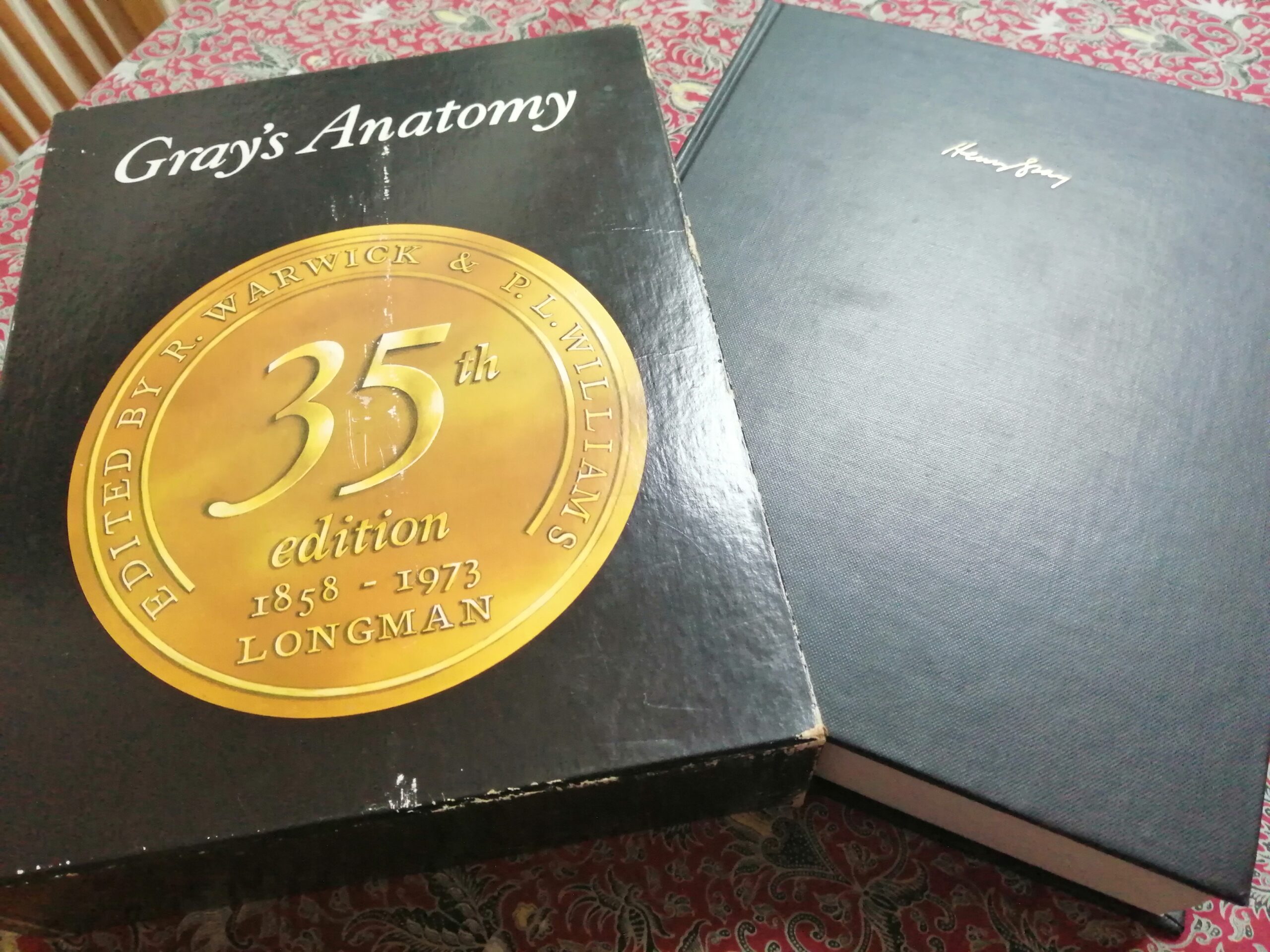
Gray’s Anatomy
One of the things I had just completed at Jarrolds was a reprinting of a famous book – Gray’s Anatomy. Gray’s Anatomy was and is the go-to book on anatomy for all anatomical students and medical students. I previously mentioned book sizes and it was a Royal Octavo book around 5 inches high. It was being reprinted because it had been added to for years and years, 100s of years – so the spine had grown to be about three inches thick. This book could not be handled by most binding machines; it was just too thick.
Also, the colours – there was colour coding to a lot of the original diagrams. This required seven colours and so that was done in letterpress on specialist machines. They had to take the sheet off and put it back on to print one or two special colours on top. Printing was; like it is now – CMYK. It’s: black, magenta, cyan and yellow. This book also had special greens and all sorts of other special colours as well – it was a logistical nightmare to print and bind.
So, they’d finally come round to the fact that they were going to have to redesign it and I got the job of helping in that redesign. It’s one of the things that I’m proud to have done. It was the 35th edition of Gray’s Anatomy and the design still survives into subsequent editions.
We took it and we looked at our equipment – it wasn’t just me; it was a Jarrold-wide effort. We looked at our big sheet fed lithographic presses that would take these huge paper rolls. They were really designed to do A4 but me and the head of graphic design, a guy called Mike Fubil came up with a design. Mike is gone now – only a few years back but we came up with a paper size that made the best use of the web. This was web offset printing and the roll was called the web. Everybody’s heard of web offset these days I think – it’s used for newspapers.
So, looking at the biggest web size that they could take – we could print a much wider page than A4. The depth would be about the same because that’s determined by the ultimate width but the length of it could be adjusted. The original Gray’s Anatomy was one column of type on a page but we came up with a page size where we could do a two-column layout. We used a wide 4-edge margin that would accommodate pictures. It had almost the same width as the original single column so images that we wanted to accommodate didn’t have to suddenly break across two columns and waste a lot of space. We could put them into the 4-edge column instead. The typeface was Plantin and we made it work brilliantly. Also, the guys who handled all the imaging took the proofs of all the original images and they turned the seven colours into four-colour process too.
We had to prove every single step on the way to the people who didn’t want to part with that job but anyway – the design worked. Professor Warwick and Professor Williams were so precious about that job. I was a Norfolk boy and these guys were so educated and suave – men of the world. It took about three years to put all that together and go to press. The 35th edition came out in my last year at Jarrolds and they were then already starting on the 36th.
The Interview
I took that book to my interview at HMSO because I was going for an interview as a typographer mainly for book work. I sat in front of that selection committee and they were good – I told you earlier that they threw bits of paper at me with different fonts and things on. They looked at my qualifications and then my portfolio. If you’re going for any sort of design job you must have a portfolio of your work. I had, within the confines of what I was doing at Jarrolds, a reasonably diverse portfolio including the redesign of Gray’s Anatomy.
I knew I’d got the job before I’d even left because initially there were four people sitting on the opposite side of the table and when I got this book out, my designs and the stage proofs of reducing the process from seven colours in letterpress to four colours in web offset – we ended up on the same side of the table. We went through what we’d done and they asked loads of questions about it and every single question that they asked me – I had the answer for.
I think it took a completely different route based on that book and I got the job. I got a note from John Westwood – the director of graphic design at that time. He was a wonderful graphic designer and he sent me a handwritten letter to say that from 200 applicants – congratulations on being one of the three that we’ve taken on.
It takes a long time to get into the civil service and of those three, one was somebody who had left because they didn’t want to leave London but then they changed their mind – so they got their old job back.
I stayed in the civil service for about 30 odd years – it’d be something like that. It was a mixture of HMSO and when it was privatised it couldn’t be ‘Her Majesty’s’ anymore so it just became The Stationery Office TSO.
It was fabulous but I retired from there just before I was 60. I mean, you were given so much autonomy. I was given customers, one of my first customers was the Ministry of Agriculture – it’s not called that anymore but MAFF and that was my customer. They were tied to HMSO in those days so for what they wanted printed – they had to come to us. I travelled the length and breadth of the country to different places and I also spent a lot of time in London.
London
We also maintained a small studio in London just to be on the spot for anything that came from the Houses of Parliament and so they used to man that from Norwich – other than one guy who was just nearing his retirement. It had moved from Atlantic House to quite close to Battersea Power Station.
I used to go down four days a week on a rolling basis and get paid a lot of extra money. I was always a keen jazz fan so I would go to Ronnie Scott’s club and I could spend some of the extra money on buying an LP or two. I got to meet many Parliamentarians; I went behind the scenes in both houses of Parliament and up the tower of Big Ben.
It was, without moving more than a few hundred yards really between where I lived when I started out working at Jarrolds and then working at HMSO, a varied career – there were elements in it which weren’t as good but I don’t think that anybody can go through their whole working life and think that everything in the garden is rosy.
But from this viewpoint – from where I am now, I wonder sometimes just how it happened. I was very, very lucky. When HMSO was privatised, it changed to TSO where I eventually ended up as Head of Graphic Design.
Richard Nelson (b.1946) talking to WISEArchive on 10th November 2025 in Dereham.
© 2025 WISEArchive. All Rights Reserved.